Learning Objectives:
• Understand how the colour wheel works
• Learn how to mix different colours using the three primary colours
• Learn how to apply paint neatly using watercolours (or acrylics)
• Learn how to mix different colours using the three primary colours
• Learn how to apply paint neatly using watercolours (or acrylics)
Begin by watching the video below, which explains the primary and secondary colours, and how colours are mixed.
The Colour Wheel
Look at the colour wheel in the PowerPoint below. Can you identify which are the primary colours, secondary colours and tertiary colours?
Primary colours cannot be mixed (unless you work in a paint factory!):
Yellow Red Blue
Secondary colours are made by mixing two primary colours together:
• Which two colours do you mix to make orange?
• Which two colours do you mix to make green?
• Which two colours do you mix to make purple?
• Which two colours do you mix to make green?
• Which two colours do you mix to make purple?
Tertiary colours are made by mixing two primary colours together, but with more of one than the other
• How do you make a yellowish-green?
• How do you make a blueish-green?
• How do you make a yellowish-orange?
• How do you make a reddish-orange?
• How do you make a blueish-purple?
• How do you make a reddish-purple?
• How do you make a blueish-green?
• How do you make a yellowish-orange?
• How do you make a reddish-orange?
• How do you make a blueish-purple?
• How do you make a reddish-purple?
Your Task (if you have watercolours or acrylics available to you)
• Draw the outlines of the colour wheel in your sketchbook and annotate which colour goes where
• Paint all of the primary, secondary and tertiary colours onto your colour wheel. You are only allowed to use yellow, red and blue, so you will need to mix all of the secondary and tertiary colours yourself.
• Paint all of the primary, secondary and tertiary colours onto your colour wheel. You are only allowed to use yellow, red and blue, so you will need to mix all of the secondary and tertiary colours yourself.
The video below shows you how to draw a neat colour wheel:
Tints and Shades
• A tint is the particular variety or hue of a colour, as there are many more colours than are listed here
• A shade is how light or dark a colour is
Harmonious and Complementary Colours
• Colours that are next to one another on the colour wheel are known as harmonious colours.
It is easy to blend from one to the other because they are similar
It is easy to blend from one to the other because they are similar
• Colours that are opposite one another on the colour wheel are known as complementary colours
It is not so easy to blend from one to the other because you are likely to create brown in the process
It is not so easy to blend from one to the other because you are likely to create brown in the process
Warm and Cool Colours
• The colours we associate with hot things are the warm colours. For example:
The sun Fire Water The ocean
• The colours we associate with cold things things are the cool colours. For example, water and the ocean
Which colours are not on the colour wheel?
• Brown is made by mixing the three primary colours together.
You can create different types of brown by mixing these colours in different quantities.
You can create different types of brown by mixing these colours in different quantities.
• White cannot be mixed, but it is not a primary colour because it does not create
secondary or tertiary colours. When added to other colours to make pastel colours.
secondary or tertiary colours. When added to other colours to make pastel colours.
• Black is made by mixing blue and brown together, but with more blue than brown (60:40)
Colour & Mood
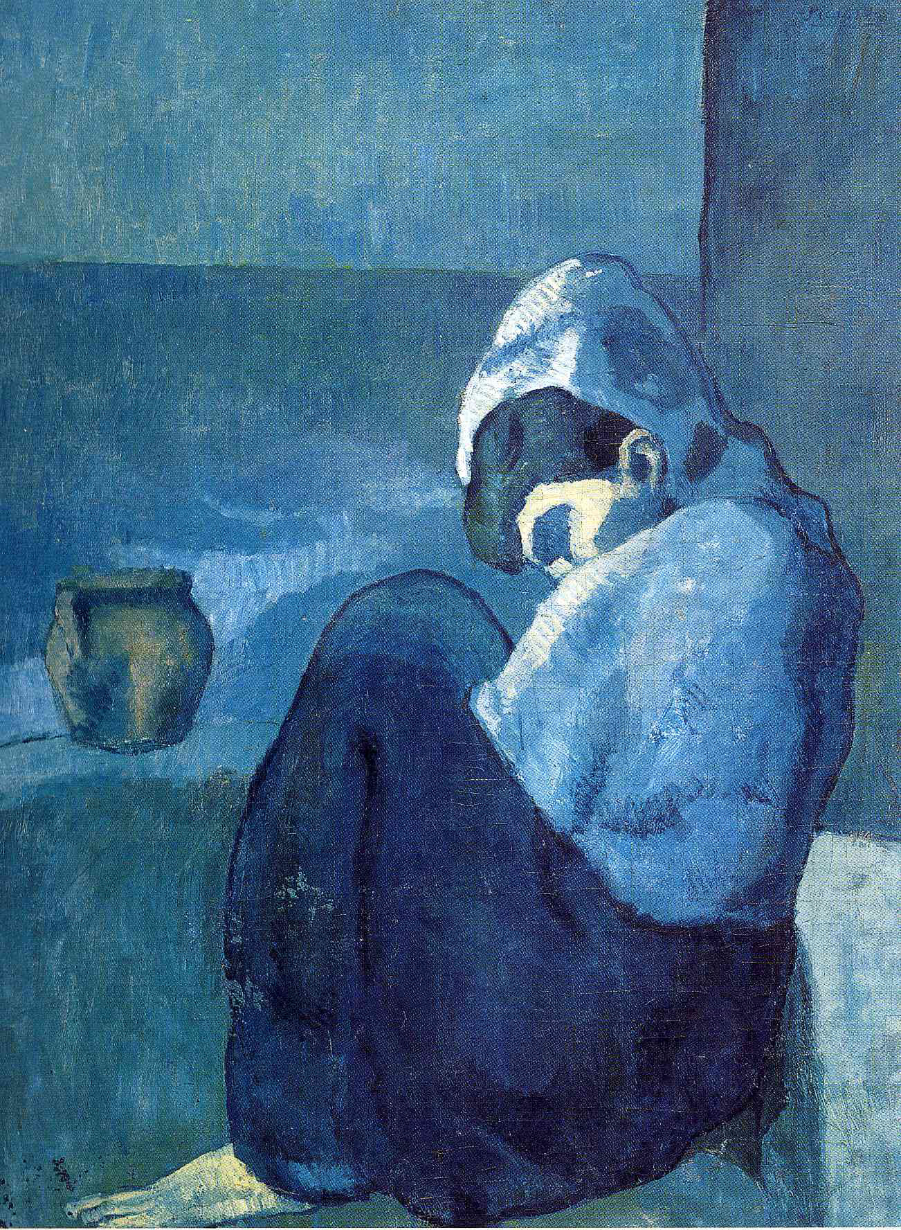
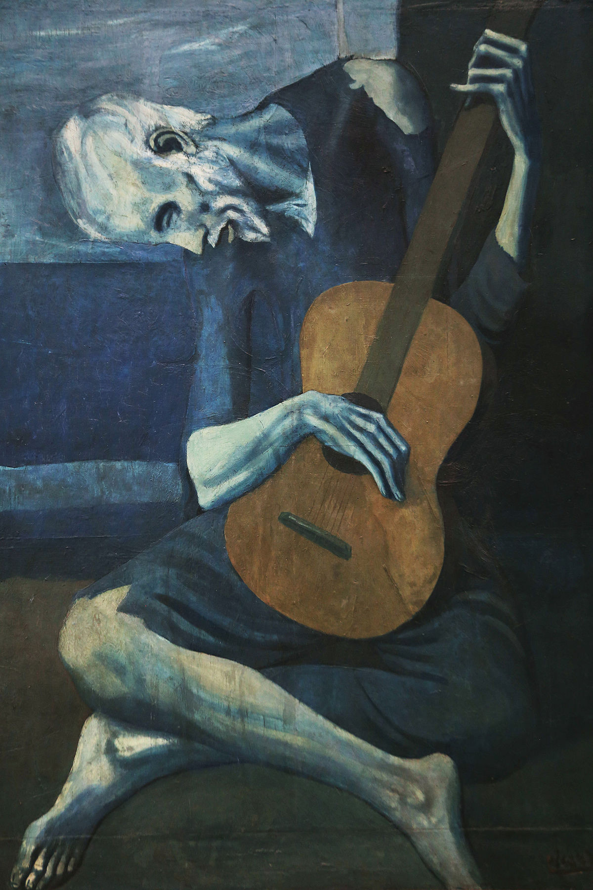
How do different colours influence our mood? The two paintings above were created by Pablo Picasso during a period of his life nowadays referred to as his Blue Period. Describe how these images above make you feel.
1 What do you see?
2 How do the colours used influence the way you feel about the painting?
3 How different would the 'story' in each painting be, had Picasso used warmer colours?
4 What else, other than his choice of colour, did Picasso do in these paintings to influence the mood?
2 How do the colours used influence the way you feel about the painting?
3 How different would the 'story' in each painting be, had Picasso used warmer colours?
4 What else, other than his choice of colour, did Picasso do in these paintings to influence the mood?
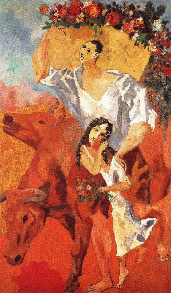
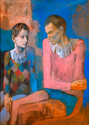
Pablo Picasso was happier during at other times in his life. The two paintings above were from his Rose Period. Describe how these images above make you feel.
1 What do you see?
2 How do the colours used influence the way you feel about the painting?
3 What else is influencing the mood of these paintings, other than the colours used?
2 How do the colours used influence the way you feel about the painting?
3 What else is influencing the mood of these paintings, other than the colours used?
Search on the Internet to find other artists who have used colour to influence your interpretation of their paintings. For example:
• Mark Rothko
• Roy Lichtenstein
• Edvard Munch
Write a paragraph about each to describe their use of colour and to compare how they have used colour in different ways to one another.
• Roy Lichtenstein
• Edvard Munch
Write a paragraph about each to describe their use of colour and to compare how they have used colour in different ways to one another.