Learning Objectives:
• Learn about the style of artist Martin Craig-Martin
• Develop a creative use of composition in a still life setup
• Understand the role of colour in art
• Understand how to look at objects from different viewpoints
• Develop a creative use of composition in a still life setup
• Understand the role of colour in art
• Understand how to look at objects from different viewpoints
What you will need:
The images you took of objects last lesson, your sketchbook (or sketching paper), a pencil, pencil sharpener, eraser and a black pen.
Choosing your objects
Take your objects from last lesson and start sketching them in your sketchbook.
1. Draw each item individually (lines only, no shading) in pencil
2. When you are happy they are correct, go over them with a black pen (but not too thick)
2. Draw them together as an interesting composition, overlapping in the same style as Michael Craig-Martin
2. When you are happy they are correct, go over them with a black pen (but not too thick)
2. Draw them together as an interesting composition, overlapping in the same style as Michael Craig-Martin
CLASS WORK: Practising the outlines:
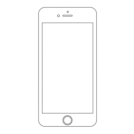
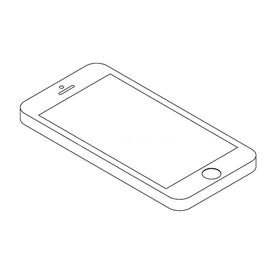
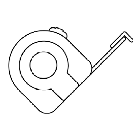
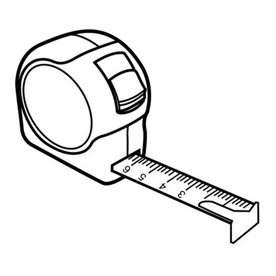
Notice how some of these look 3D, while some are more flat. Are you ready for the challenge?
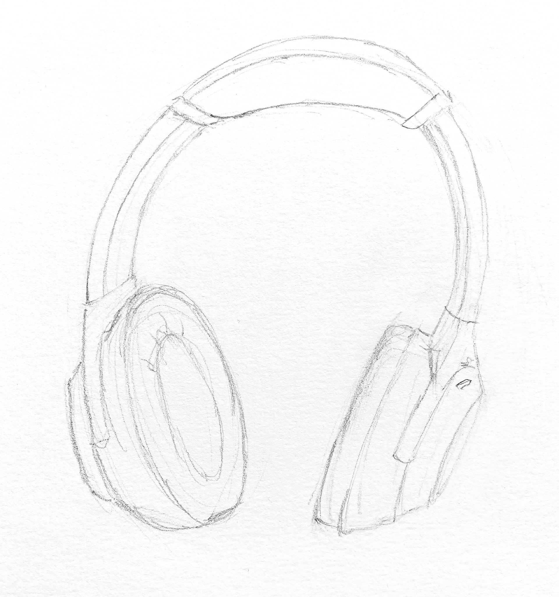
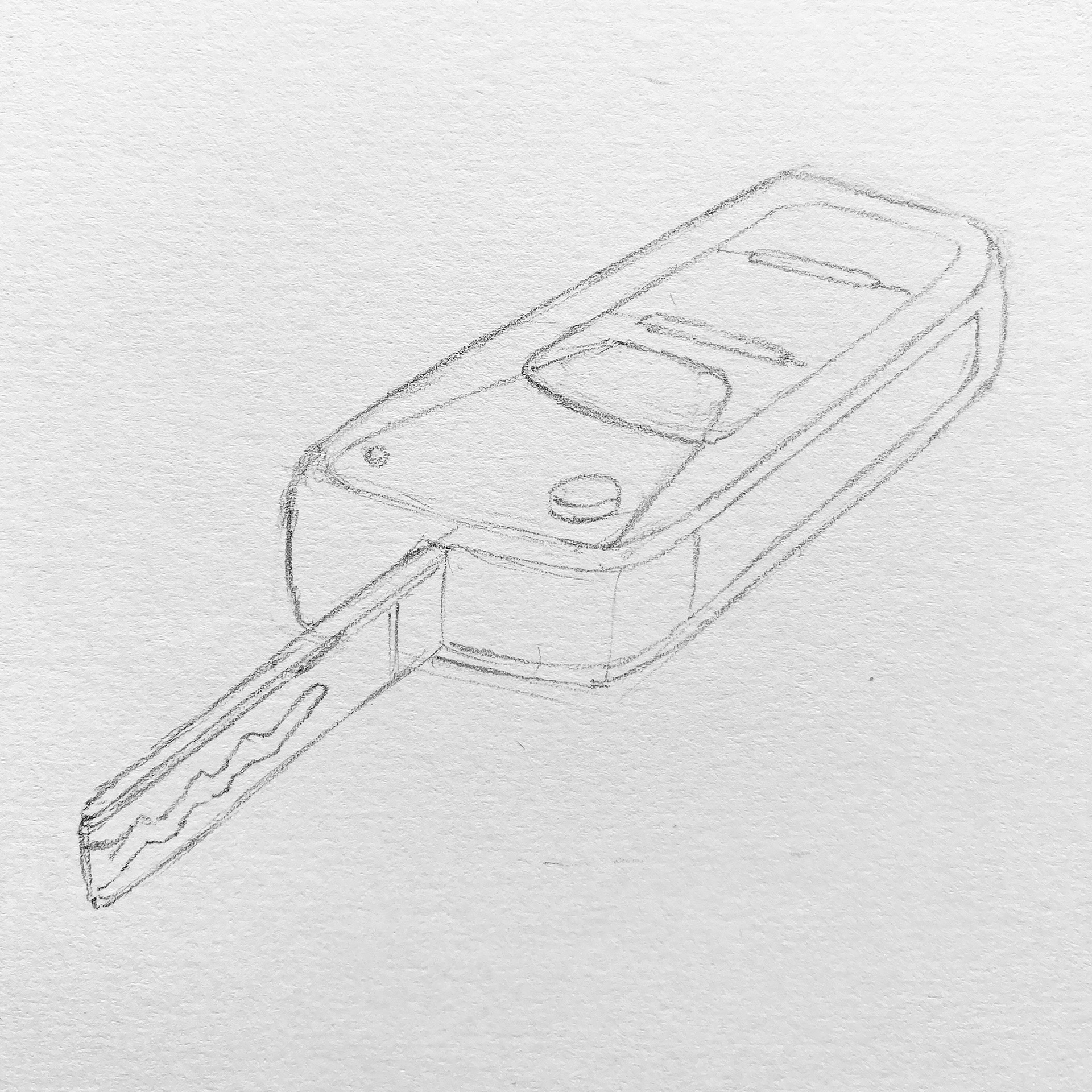
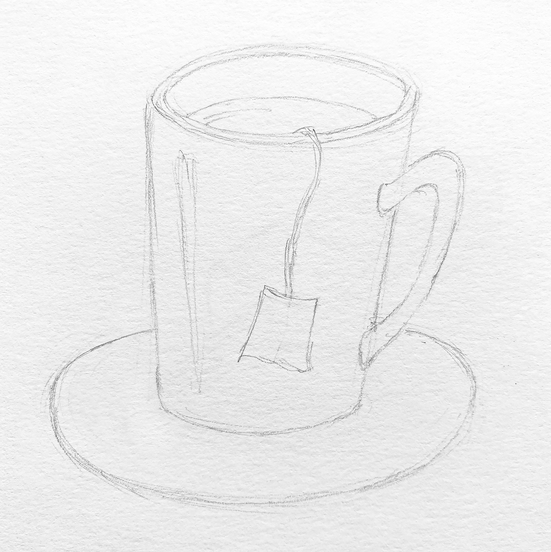
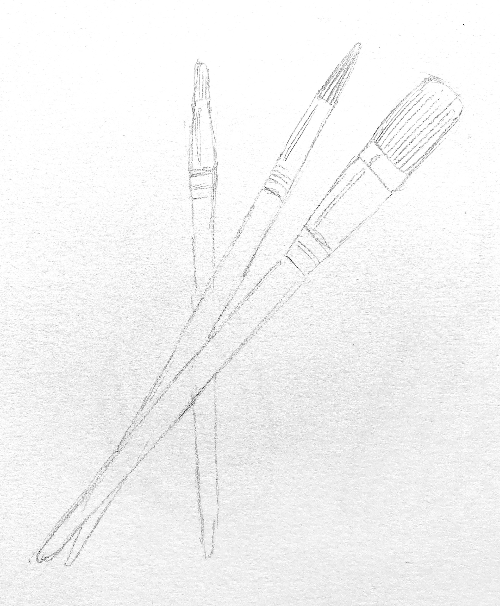
Mr Lax's drawings:
I decided to theme my painting on 'leisure'. The objects below represent listening to music (headphones), travelling/visiting friends (car key), drinking tea (mug) and painting (paint brushes). You don't have to theme your painting, but perhaps the objects you have chosen say something about you?
Demo:
Thinking about viewpoints
What makes the most interesting angle from which to look at your chosen objects? Below are some examples of how objects often look better from an angle, rather than looking at them straight on. What do you think?
HOMEWORK: Creating your composition
Draw your objects out again on a new page in your sketchbook, overlapping them to make an interesting and creative composition. This will be a practise, not the final piece.
What makes a good composition?
• Lots of overlapping!
• Objects with interesting shapes
• Lots of different angles (with plenty of curved shapes and diagonals)
• Fill the page so the objects go off the edge
• Interesting negative spaces
• Objects with interesting shapes
• Lots of different angles (with plenty of curved shapes and diagonals)
• Fill the page so the objects go off the edge
• Interesting negative spaces
What are negative spaces?
When you place several objects together in a picture, the spaces between them are known as negative spaces. If you can train your eye to see the shapes of the spaces instead of the shapes of the objects, then you will find it easier to create interesting compositions.
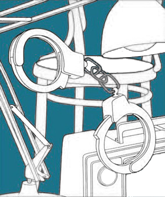
This is an examples of the negative space in one of Michael Craig-Martin's paintings:
By removing all of the colours but the background, you can now see the shapes between each object.
Paintings with interesting negative spaces often have the best compositions, so think carefully about how you will position your objects.
Are you up for a challenge?
Next lesson, you will be able to choose to colour your work in either colouring pencil or paint and you can choose from one of these 3 levels of challenge, depending on your ability...
For a basic composition:
Higher ability:
Top ability:
BONUS MARKS:
Higher ability:
Top ability:
BONUS MARKS:
Draw 3 objects that will overlap one another later on when you come to form your Michael Craig-Michael composition. You will draw/paint these to fill a whole page in your class sketchbook (or an A3 piece of paper/card).
If you are ready for a challenge, draw 5 objects that you will combine together on an A3 (or bigger) piece of paper/card or a canvas (if you have one).
If you're excited to go big, then go big! Choose as many objects as you want and as big a canvas (or piece of card) as you want.
How about drawing your objects from an angle so that they look 3D?
What paper should I use?
• Using colouring pencils? Then any smooth paper will work, but preferably not too thin.
• Using watercolours? The thicker the better, otherwise it may go wavy and could tear if it gets too wet.
• Using acrylics? The thicker the better, but if you don't use much water you can get away with thinner paper. If you're feeling like a pro, you could even use a canvas!
Mr Lax's composition
I have drawn my objects together so that they overlap. I like how they are not all to scale, how they look a bit 3D with the perspective I chose, as well as how I have kept them quite simple, but added a few details here and there to stop it looking like silhouettes. The paint brushes are simple shapes, but they work well to add diagonals to the composition and they break up the negative space (the gap) between the headphones and the mug. I decided not to include the teabag because it got in the way.
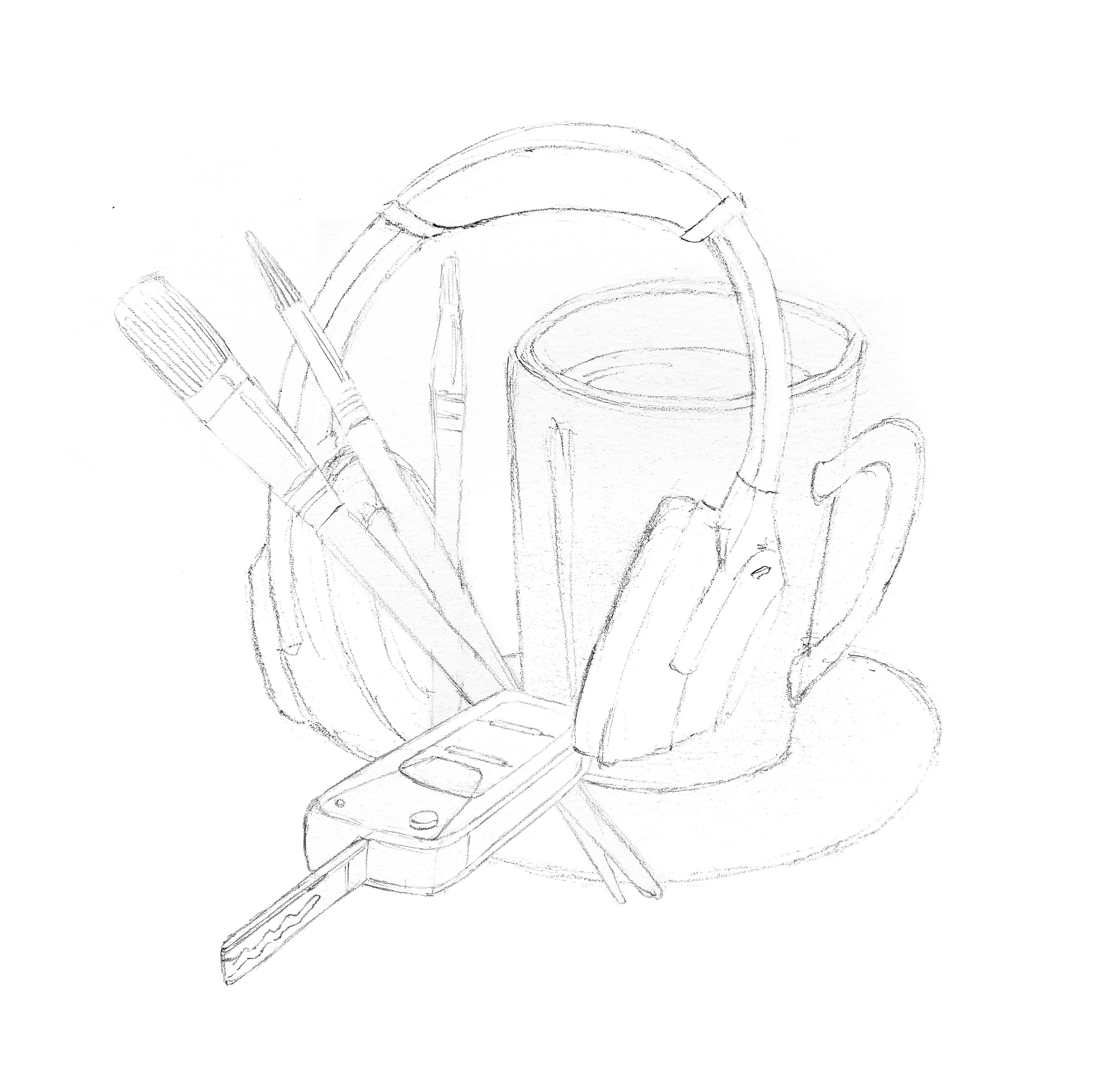
To improve on this design in future, I probably would draw the mug a bit smaller and add something in the bottom right corner to break up the space a bit more.
How about some symmetry?
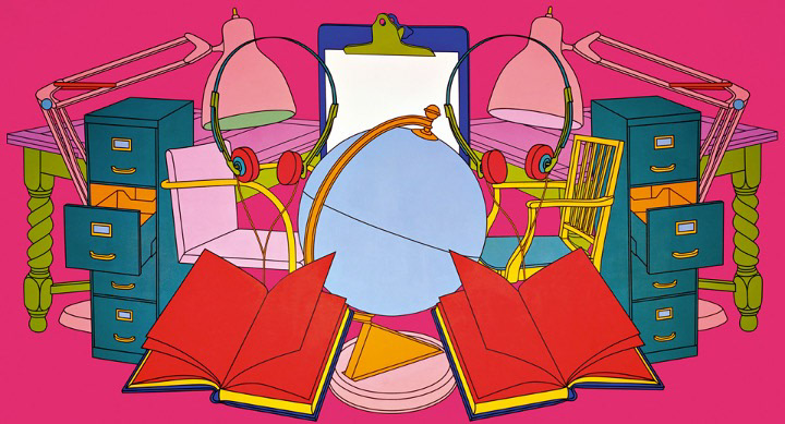
Why not make your painting symmetrical by mirroring the left hand side onto the right hand side, like this painting?
Submit your work on ClassCharts or, if you are struggling, by email.